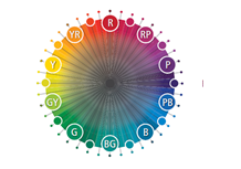
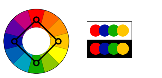
The Color Wheel:
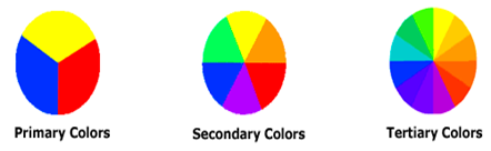
The color wheel or color circle is the basic tool for combining colors. The first circular color diagram was designed by Sir Isaac Newton in 1666. The color wheel is designed so that virtually any colors you pick from it will look good together. Over the years, many variations of the basic design have been made, but the most common version is a wheel of 12 colors based on the artistic color model.
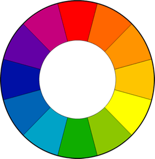
Primary, Secondary and Tertiary Colors:
Primary Colors:
Red, yellow and blue In traditional colour theory ( used in paint and pigments), primary colors are the 3 pigment colors that can not be mixed or formed by any combination of other colors. All other colors are derived from these 3 hues.
Secondary Colors:
Green, orange and purple These are the colors formed by mixing the primary colors.
Tertiary Colors:
Yellow-orange, red-orange, red-purple, blue-purple, blue-green & yellow-green
These are the colors formed by mixing a primary and a secondary color. That’s why the hue is a two word name, such as blue-green, red-violet, and yellow-orange.
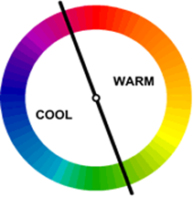
Warm and cool colors:
The color circle can be divided into warm and cool colour Warm colors are vivid and energetic, and tend to advance in space. Cool colors give an impression of calm, and create a soothing impression. White, black and gray are considered to be neutral.
Tints, Shades, and Tones:
Tints:
Adding white to a pure hue If a color is made lighter by adding white, the result is called a tint.
Shades:
Adding black to a pure hue: If black is added, the darker version is called a shade.
Tones:
Adding gray to a pure hue: if gray is added, the result is a different tone.
Color Harmonies – basic techniques for creating color schemes:
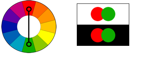
Complementary color scheme:
Colors that are opposite each other on the color wheel are considered to be complementary colors (example: red and green). The high contrast of complementary colors creates a vibrant look especially when used at full saturation. This color scheme must be managed well so it is not jarring. Complementary color schemes are tricky to use in large doses, but work well when you want something to stand out.
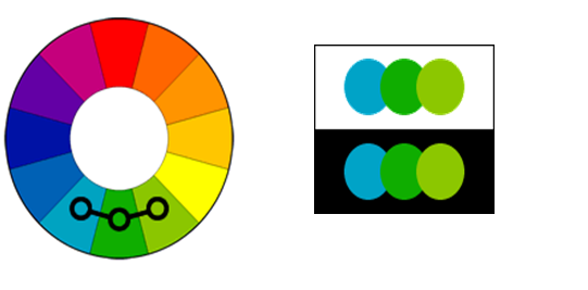
Analogous color scheme:
Analogous color schemes use colors that are next to each other on the color wheel. They usually match well and create serene and comfortable designs. Analogous color schemes are often found in nature and are harmonious and pleasing to the eye. Make sure you have enough contrast when choosing an analogous color scheme. Choose one color to dominate, a second to support. The third color is used (along with black, white or gray) as an accent.
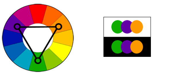
Triadic color scheme:
A triadic color scheme uses colors that are evenly spaced around the color wheel. Triadic color schemes tend to be quite vibrant, even if you use pale or unsaturated versions of your hues. To use a triadic harmony successfully, the colors should be carefully balanced – let one color dominate and use the two others for accent.

Rectangle (tetradic) color scheme:
The rectangle or tetradic color scheme uses four colors arranged into two complementary pairs. This rich color scheme offers plenty of possibilities for variation. Tetradic color schemes works best if you let one color be dominant. You should also pay attention to the balance between warm and cool colors in your design.
Square color scheme:
The square color scheme is similar to the rectangle, but with all four colors spaced evenly around the color circle. Square color schemes works best if you let one color be dominant. You should also pay attention to the balance between warm and cool colors in your design.
Basics for Handling colours in the textile and dyeing industry:
Metamerism is a big issue in the textile and dyeing industry:
The metamerism phenomenon is visible when TWO samples/garments appear to have the same color under one light source (such as in store), but show a different shade under another light source (such as in day light). This means that the two garments will no longer match in day light.
In short: two colors match under one light source, but not under another.
How do you know if there is metamerism?
-You can carry out a visual assessment and compare the magnitude of the color difference of the sample to the standard under each light source.
-If the color difference is greater under one source than the other, then the sample is metameric.
– For technical reasons, metamerism may be unavoidable in some cases
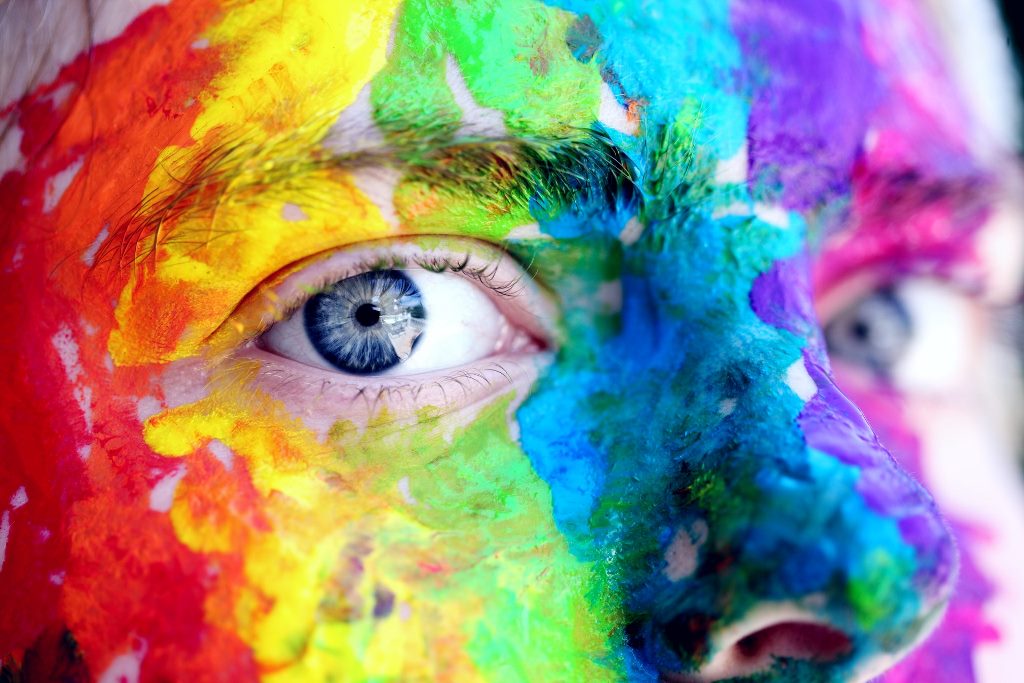
Language of the colour:
For chromatic colors:
(i.e. colors that have one particular wavelength or hue that dominant, such as yellow, orange, red, purple, blue, turquoise, and green): Color differences between a color standard and a sample of chromatic colors are described using comments about their cylindrical color coordinates.
Hue(DH):
Hue is the “color” of a color or its identity such as red, orange, green, etc. Your comments are based on whether the DH value of the sample is positive or negative compared to the standard.
Lightness(DL):
A colors degree of lightness is the luminous intensity of a color. Colors can be classified as light or dark when comparing their value.
+DL* means that the sample is lighter than the standard
–DL* means that the sample is darker than the standard
Chroma(DC):
Chroma describes the brightness or dullness of a color. In other words, how close the color is to either gray or the pure hue. Chroma is also known as saturation.
+DC* means that the sample is brighter than the standard
–DC* means that the sample is duller than the standard
For achromatic colors:
(i.e. colors where all wavelengths are present in equal amounts within those such as brown, olive, grey, white, black): Color differences between a standard and a sample of achromatic colors are described using comments about their cartesian color coordinates.
Following three color difference values are commonly used:
Lightness: (DL)
+DL* means that the sample is lighter than the standard
–DL* means that the sample is darker than the standard
Red/Green axis(Da)
+Da* means that the sample is redder than the standard
–Da* means that the sample is greener than the standard
Yellow/Blue axia(Db)
+Db* means that the sample is yellower than the standard
–Db* means that the sample is bluer than the standard
Global Color Management:
Color Visualization and Communication:
Accurately – and quickly – communicating color around the world is essential. Latest technology shows them on the created fabric so that you have a clear visualization. This efficient simulation tool helps you communicate color digitally and cost-effectively anywhere in the world. With latest technology you can be sure that the right color is communicated throughout the supply chain – and faster than ever.
Standardizing Environmental Conditions:
Changes in temperature and humidity can cause color variations in samples and affect measurements. Conditioning cabinet controls these variables and ensures that samples remain consistent anywhere in the world.
Instrument Performance Monitoring and Profiling:
You can continuously monitor your instrument’s performance to ensure accurate color measurements every time you use your spectrophotometer.
Inspection of Incoming Goods:
In order to eliminate waste and create consistent quality products, raw materials and colors must be examined very closely. Some of the system provides the controls necessary to accelerate this process and ensure the right color from the beginning.
Color Measurement:
Latest Technology enable you to make exact color measurements every time. Also industry offers a range of quality instruments to suit every situation. Some of the devices( Datacolor 550™) has the ability to make both reflectance and transmittance measurements. Also with Datacolor, you can be assured of an instrument that meets your needs.
Color Matching:
Using the right color throughout the dyeing process is the most important part of color management. Latest software significantly increases the accuracy of recipe calculation and speeds color matching/approval by providing application-adapted modules and easy-to-use interfaces for every textile dyeing application. improved productivity and lower costs. With the latest technology you can even calculate the amount of different colored fibers in a blended color( Datacolor BLEND™).
Laboratory Dispensing:
In order to achieve the right color in the lab, the correct amounts of dyestuffs and chemicals, colorants or pigments have to be dispensed perfectly and repeatedly. Technology offers of solution preparation systems and gravimetric tube-free lab dispensers ensures precise, consistent and speedy preparation of the desired color recipes
Laboratory Dyeing:
In the lab, dye formulas must show their true color the first time. This is important step of color management.
Recipe and Production Management:
Optimizing production recipes and process management is the key to a profitable dye house. Technology has the ability to archive all relevant dyeing data systematically and draw information from its experience-based database at any time. Suppliers benefit from error-free recipes perfectly adapted to their customers’ and in-house needs. The expertise and easy access help to increase productivity and reduce production costs.
Production Weighing:
Controlled production weighing ensures that the right amounts are prepared to prevent expensive re-dyeing’s.
Final Color Inspection and Quality Control:
It is important comprehensive color quality control for nearly every industry. monitor calibration, you will experience better visualization of the color on your screen in every system( Datacolor ).
Ref.:
- http://www.tigercolor.com
- Photo by Sharon McCutcheon from Pexels etc.